Smartphone and tablet usage is quickly usurping the desktop. Targeting the dizzying array of browsers, screen sizes and devices in a market experiencing hardware fragmentation is one of the challenges developers encounter. Although responsive web design does not offer a panacea for all scenarios, designing your web mapping applications to be mobile-friendly using this technique can provide an improved experience to your end-users.
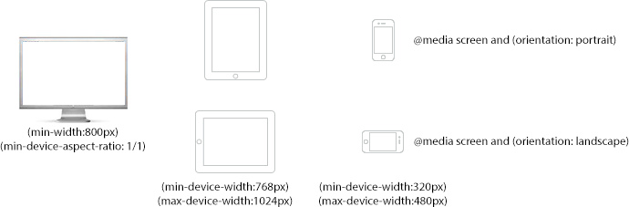
CSS3 media queries enable developers to selectively style their pages based on properties (device width or height, resolution, orientation) of the browser where the page is being rendered. For instance, you can now choose to style a page differently for a small screen such as smartphone versus a slightly larger screen such as a tablet, or the desktop.
Using the Legend Widget sample as a starting point, I will show you how I modified an ArcGIS API for JavaScript application to support tablet (768 x 1024px) and smartphone devices (320 x 480px).
No comments:
Post a Comment